Thursday, 22 March 2012

Friday, 16 March 2012
Drawing Folds
Naomi from work just sent me a few cool links about drawing folds that I need to read later:
http://sevencamels.blogspot.com/2008/02/famous-artists-course-folds-part-one.html
http://sevencamels.blogspot.com/2008/03/famous-artists-course-folds-part-2.html
http://sevencamels.blogspot.com/2008/02/famous-artists-course-folds-part-one.html
http://sevencamels.blogspot.com/2008/03/famous-artists-course-folds-part-2.html
Saturday, 18 February 2012
John William Waterhouse

This image is famous but for some reason I never knew the name of the artist.
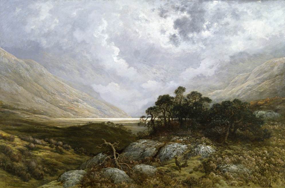
Lawrence Alma-Tadema

I just learned about an artist called Lawrence Alma-Tadema.
http://en.wikipedia.org/wiki/Lawrence_Alma-Tadema
Thursday, 16 February 2012
Howard McWilliam
http://www.mcbill.plus.com/
Luke mentioned an excellent illustrator who transitioned into art while doing a full time job.
Luke mentioned an excellent illustrator who transitioned into art while doing a full time job.
Wednesday, 15 February 2012

Sunday, 12 February 2012
3 speed paintings

I'm trying to learn how to paint environments. These aren't great, but they are fairly quick (the longest is maybe 1.5 hours). The desert scene took the longest despite being a weaker composition than the other two. I guess you can't improve a bad idea with time.
Saturday, 11 February 2012
Hungover Reflections
I did this comic with Emily Watson last year (start of 2011). It was published in 9th art magazine and brings back a lot of good memories.


Friday, 3 February 2012


Thursday, 2 February 2012

Thoughts from Lavender Hill
A lot more good advice was given at class on Tuesday:
- A good drawing should work at every stage.
- Stand back to evaluate your work. If you get close to a Sargent or Rembrandt they can almost look abstract close up. This makes perfect sense - you have to stand back, so you expect it be in focus where it will be observed, not where the paint happens to be applied.
- Observe, think about what you need to change and then walk up to the canvas to make the change
- Work very big occasionally. Working at one scale constantly will lock you to that scale.
- Spend the most time on defining the shadow shapes. Refining these shapes will naturally lead to softness where it is required.
- Don't forget your mid-tones. In my case while focusing on shadow shapes I blocked out the light of a leg and the torso to be the same. The torso was actually a lot brighter than the leg.
Friday, 27 January 2012
Thursday, 26 January 2012

Wednesday, 25 January 2012
A repost from Gurney
I was reading Gurney's blog today and came across this article:
I'm not sure what to think. I don't buy the implicit prejudice that the original work these Chinese painters produce would be of dubious quality simply because they are not living in France or Amsterdam in 1890. In one image they also insultingly refer to original portraits as Kitsch - I guess the art academics from 1920 have truly won in their effort to convince everyone that avant garde art is the only thing of any value.
It is definitely scary that so many artists work for so little.
Monday, 23 January 2012
A quick link
While browsing the web I just found the following:
I need to download the iphone app later
Monday, 9 January 2012
A few tips
I ran into John yesterday at W.H. Smith while browsing through the magazines looking for Imagine FX. We ended up talking about atmospheric effects and colour shifting.
John made a good observations about colour temperature and how to increase the intensity of a light using hue and saturation shifts.
The basic idea is that as things get hotter you should shift hue towards yellow. For instance, a hot red would start as 100% saturation dark red. Then decrease the saturation a bit, increase the value a little and shift the hue towards yellow for a mid orange. At the hottest point it would be a much lower saturation but very high value yellow. We grabbed a coffee and ended up comparing the techniques while doing quick digital sketches of a green neon sign - the results are fairly dramatic and proved the point.
John also talked about the effect of "white balance" on our eyes. Our brain is colour correcting for the environment around us, which explains why shops appear to use coloured lights when viewed from the street but the light looks white when you go inside.
The blue highlights in the hair in my image below is the same thing. I wondered at the time where the blue was coming from because the model was in a white room without a significant blue bounce source (white walls, incandescent lights). The light was most likely white but colour correcting for the yellow light source shifted this to blue.
When doing a digital portrait consider the colour of the shirt the person is wearing. This should be a bounce light colour.
Wednesday, 4 January 2012


Saturday, 31 December 2011
A few more artists
Winslow Homer

Eastman Johnson, especially "Cranberry Harvest"

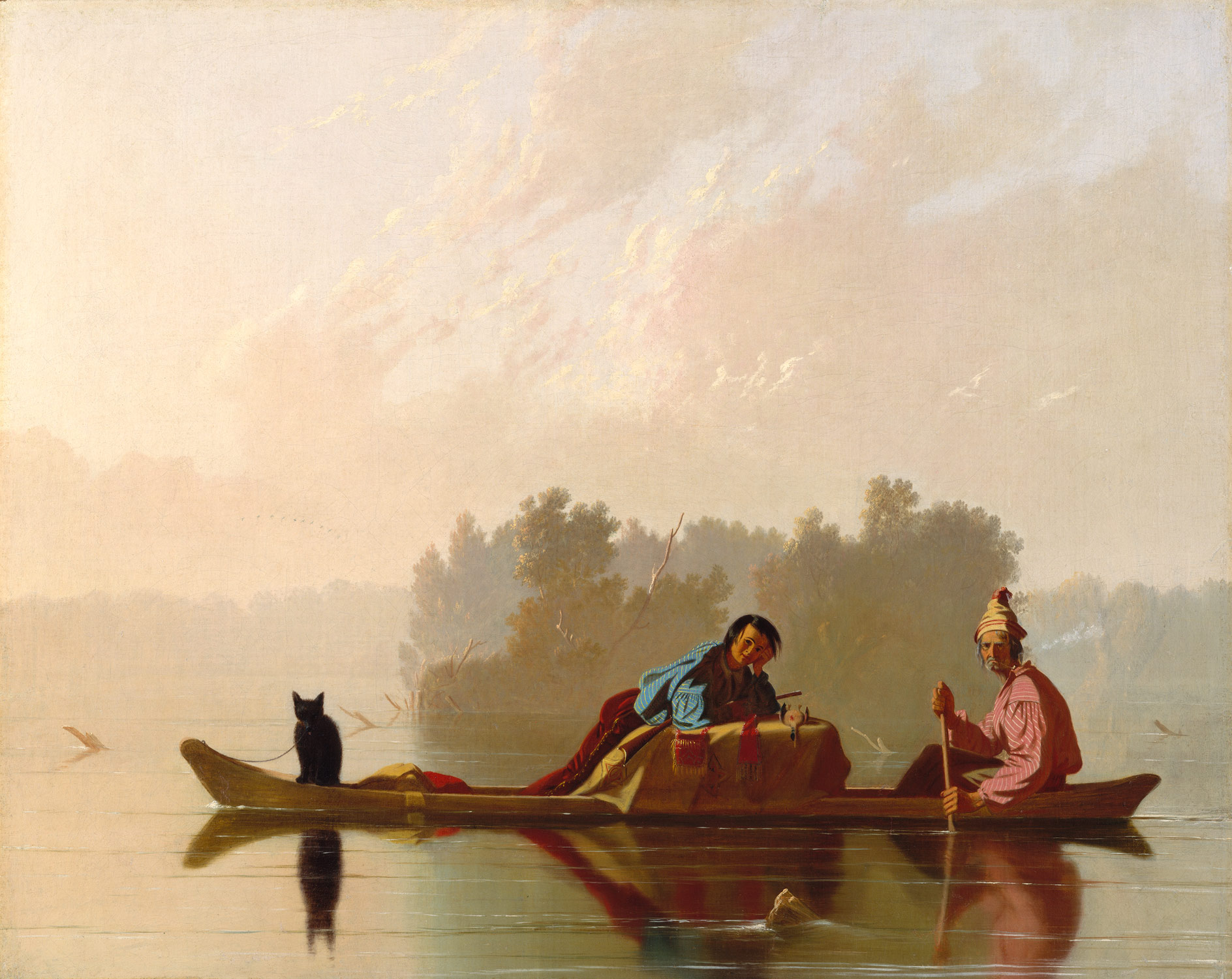
George Caleb Bingham - "Fur Traders"
John Singer Sargent's painting called "The Daughters" looks amazing. I think Madame X is incredible and I might see if I can paint a similar pose one day.
Childe Hassam "Rainy Day" reminds me of Richard Estes but in 1885

Andrew Wyeth "Tenant Farmer"
Norman Rockwell
Charles Bell "Sixteen Candles"

Ralph Goings
Richard Estes "Downtown"
Steve Hawley "Descent from the Cross"
John Nava "2nd of May, Los Angeles"
Subscribe to:
Posts (Atom)